Results of the St. Pat's 10 Miler and 5K
Recently I ran the St. Pat's 10 Miler in Atlantic City, Nj. It was my first official running event ever and I enjoyed it lot.
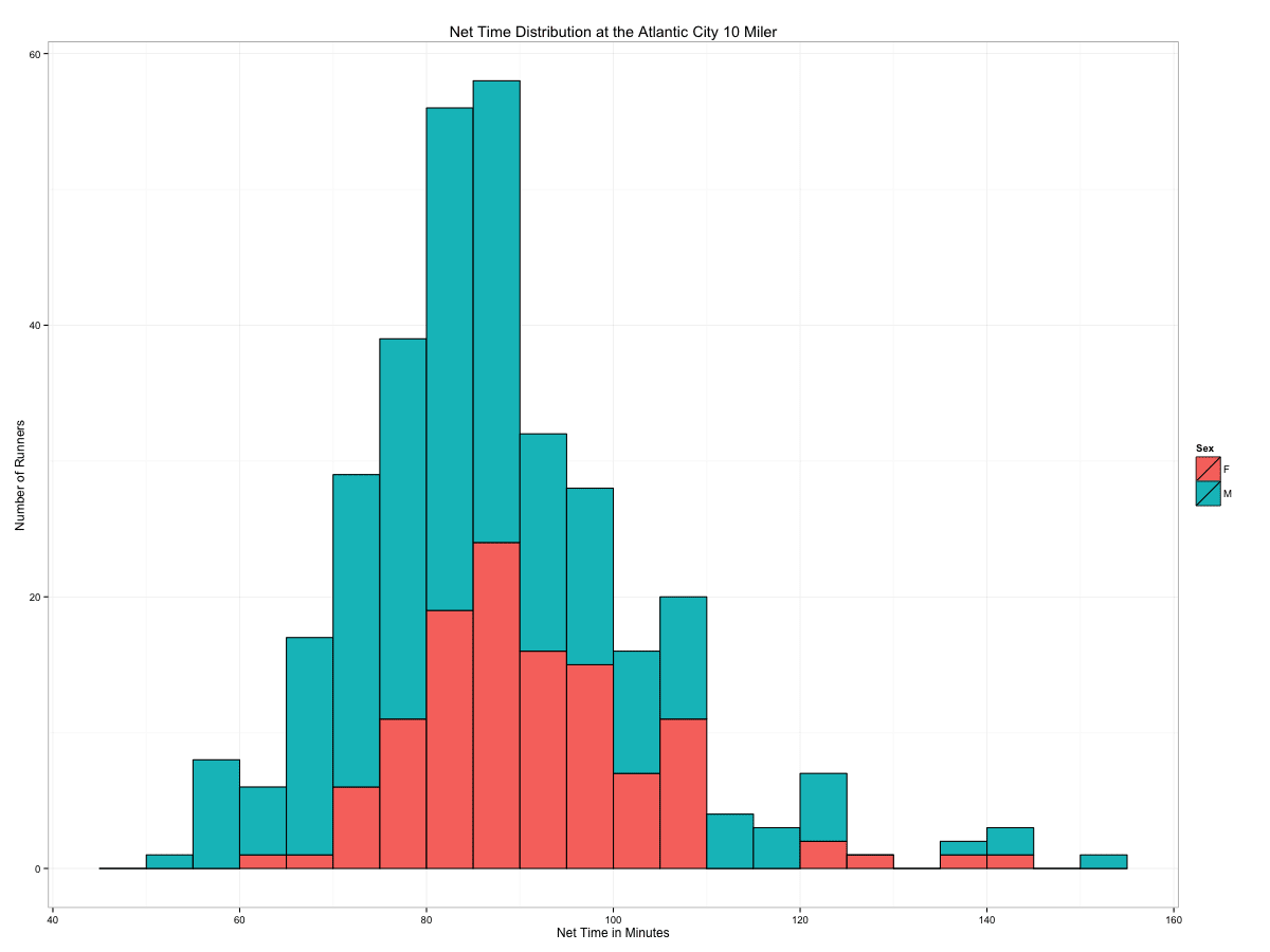
Shortly after the race the official results have been posted on the Internet. The data did not only include the number and times of the participants but also gender and age. Looking at the finisher time distribution it shows that most runners finished at around 90 minutes:
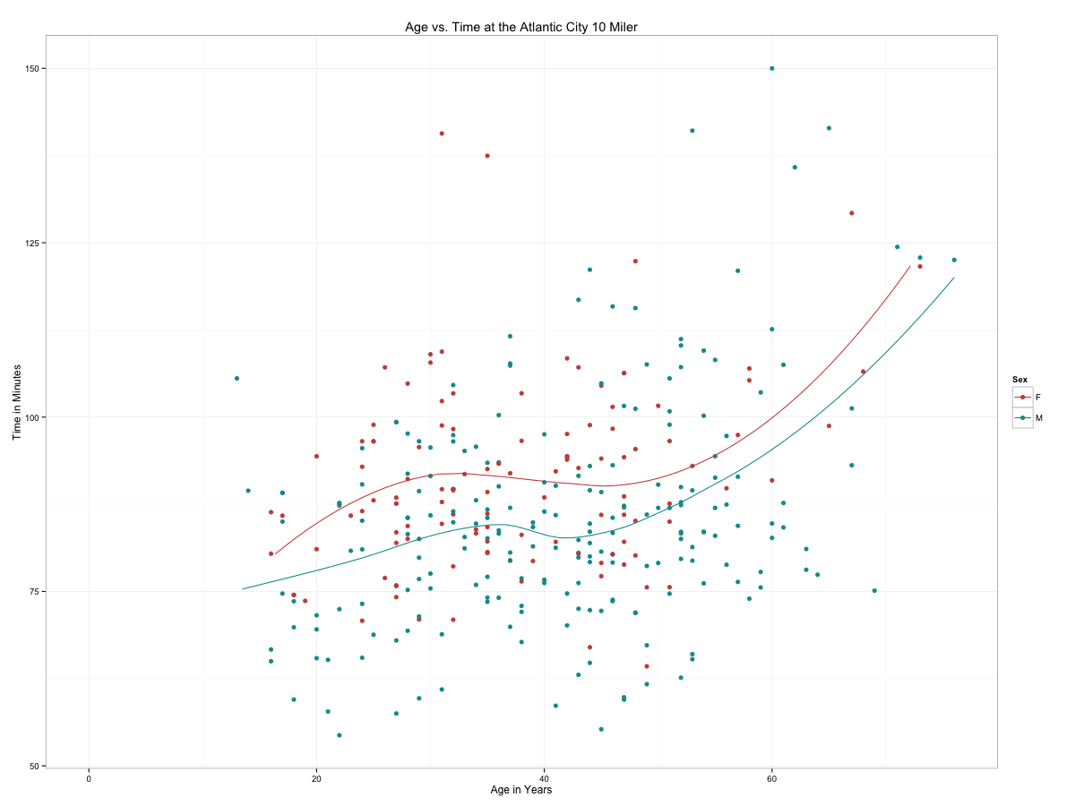
How does age affect the finishing time?
The code to generate the images:
This file contains hidden or bidirectional Unicode text that may be interpreted or compiled differently than what appears below. To review, open the file in an editor that reveals hidden Unicode characters.
Learn more about bidirectional Unicode characters
data <- read.csv(file = "2008TenMiler.csv", header = TRUE, sep=",") | |
summary(data) | |
data <- na.omit(data) | |
#convert time to minutes | |
data$Nettime <- as.character(data$Nettime) | |
data$Nettime <- sapply(strsplit(data$Nettime, ":"), | |
function(x) { | |
x <- as.numeric(x) | |
x[1]*60 + x[2] + x[3]/60 | |
} | |
) | |
men <- data[data$Sex == "M",] | |
women <- data[data$Sex == "F",] | |
library(ggplot2) | |
p <- ggplot(data, aes(Age, Nettime, color=Sex)) + theme_bw() | |
p <- p + geom_point(shape = 19) + geom_smooth(method=loess, se=FALSE, fullrange=T) + scale_colour_hue(l=50) | |
p <- p + ggtitle("Age vs. Time at the Atlantic City 10 Miler") + ylab("Time in Minutes") + xlab("Age in Years") | |
p | |
p <- ggplot(data, aes(Nettime, fill=Sex)) + theme_bw() | |
p <- p + geom_histogram(binwidth=5, colour="black") | |
p + ggtitle("Net Time Distribution at the Atlantic City 10 Miler") + ylab("Number of Runners") + xlab("Net Time in Minutes") |